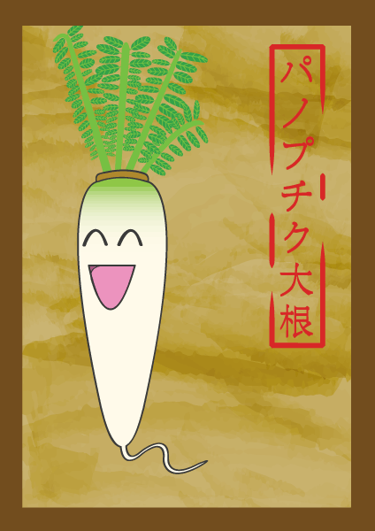
This is the second logo I made for my music project Panoptic Daikon. Made in illustrator i tried to create an aged paper kind of look. I tried to put the equivalent of the name in kanji and tried to make it look like a pseudo Hanko Stamp. I was inspired by the old Japanese scrolls with artwork on them but tried to retain the cartoony look of the original PD logo. Overall this version of the Daikon is much cuter than the first one.


